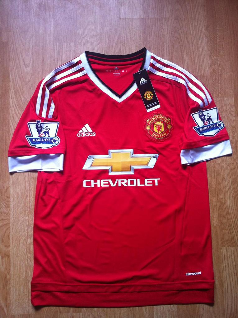
Never liked the "Chevrolet" logo, but the design is nice. Much better than the tablecloth.
{{ searchResult.errors[0] }}
Never liked the "Chevrolet" logo, but the design is nice. Much better than the tablecloth.
I hear they'll get a good 100M from it
Too many strips; or maybe its just a matter of getting use to......
If it wasn't for those godforsaken air ventilations on the sides, the kit would actually turn out to be nice and classy.
It looks cool.
Agree with @Hesinburg
Liverpool one

Agree with @Hesinburg

Just a banter . No need to get so senstive :D I had to share it .
Those stripes underarms not appealing to me But I really like this version better .


Just a banter . No need to get so senstive :D I had to share it .
But I really like this version better . Those stripes underarms not appealing to me .

The Chevrolet logo looks way smaller so overall it seems to be a great kit. Also, it looks very real. If you look closely or zoom in you can notice the entire image has the same resolution so no picture overlay or lvl 9000 editor.
@Heisinburg
The side "vents" only look ugly because the jersey is flattened, in a torso-shape it actually looks great.

I like it, but will the adidas lines not have a space in between for like the BPL logo like they do with most shirts? If not, it will just look like the ones they used 10 years ago and such.
Looks like this will be the kit which will be unveiled August 1st:


Inspired by previous classic Adidas kits:
Looks like this will be the kit which will be unveiled August 1st:

Inspired by previous classic Adidas kits:

Looks kinda ugly.
Wait until players wear it, that always changes people's perspective. It is a great improvement from last season's kits. Im looking forward to see the name and number's color in order to decide which one Im going to buy.
Bold and interesting look.